Vol.1 菓心おおすが 筆
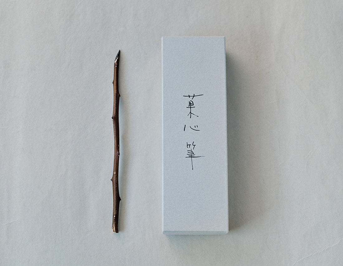
菓心おおすがの店名ロゴは、グラフィックデザイナーの井上由季子さんに橘の木の枝で、描いていただきました。
その木の枝が収まっているグレーの箱。ただ眺めるのが好きである。
蓋に描かれた文字の余白、筆が収まっている静かな佇まい、ただそこにある美しさ。
余白が語りかける。
毎日の中にも、デザインにも。
そして、お菓子づくりと向き合うときにも―――
心のどこかに、そっと余白を残しておきたい。
Kashin Ohsuga –Calligraphy Branch Pen
The store logo for Kashin Ohsuga was hand-drawn by graphic designer Yukiko Inoue, using a branch from a tachibana tree.The gray box that holds that branch—simply gazing at it brings a quiet joy.The blank space around the characters drawn on the lid, the calm presence of the brush resting within—it is beauty, simply existing.
The blank space speaks.
In everyday life In design. And even when we face the art of making sweets—
We want to leave a little blank space somewhere in our hearts.
